Stay informed with our newsletter.


EN


Explore the intriguing world of brand trivia with little-known facts about 10 famous logos. Uncover the hidden stories, unique details, and design secrets behind some of the world's most recognizable brand symbols. From historical origins to surprising elements, this deep dive reveals what makes these iconic logos truly special. Discover the fascinating tales that have shaped these enduring emblems.

1. Apple
The original Apple logo featured Sir Isaac Newton sitting under an apple tree.
Designed by Ronald Wayne in 1976, the original Apple logo depicted Newton discovering gravity. This complex design was soon replaced by the iconic bitten apple, designed by Rob Janoff, for a simpler and more modern look.
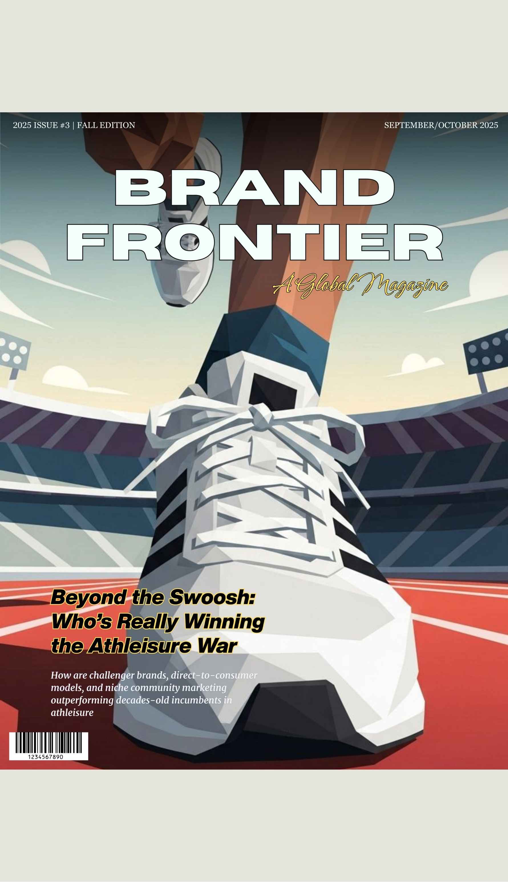
2. Nike
The Nike "Swoosh" logo was designed for just $35.
In 1971, graphic design student Carolyn Davidson created the Swoosh for Nike co-founder Phil Knight. Despite its low cost, the logo became one of the most recognizable symbols in sports and fashion. Davidson was later compensated with shares in the company.
3. Coca-Cola
The Coca-Cola logo hasn’t changed much since it was first created in 1886.
The distinctive script was designed by Frank Mason Robinson, the company’s bookkeeper. The logo's enduring design has helped maintain its status as one of the world's most recognizable brands.
4. FedEx
The FedEx logo features a hidden arrow.
Created in 1994 by Lindon Leader, the FedEx logo cleverly incorporates an arrow between the "E" and the "X" in "Ex." This hidden arrow symbolizes speed and precision, core attributes of FedEx's service.
5. Amazon
The Amazon logo's arrow points from A to Z.
The arrow under the Amazon logo not only forms a smile but also signifies that the company offers everything from A to Z. This clever design reinforces Amazon's vast product range and customer satisfaction.
6. Toyota
Toyota’s logo contains every letter of the company's name.
Introduced in 1989, Toyota's three overlapping ovals form a stylized "T" and also contain all the letters of "Toyota" when rearranged. The design symbolizes the trust between the company and its customers.
7. Pepsi
The Pepsi logo's color scheme is based on the American flag.
The red, white, and blue colors of the Pepsi logo were introduced during World War II to show patriotism and support for American troops. The current logo, designed by Arnell Group in 2008, retains this color scheme with a modern twist.
8. Samsung
Factoid: The Samsung logo means "three stars" in Korean.
"Samsung" translates to "three stars" in Korean, symbolizing greatness and strength. The original logo featured three stars, but it was redesigned in 1993 to the current simple blue oval to signify a modern and global outlook.
9. Google
The Google logo has a non-traditional color order.
Designed by Ruth Kedar, the Google logo features primary colors with one secondary color (green) on the letter "L." This breaks the traditional color pattern, reflecting Google's mission to be unconventional and innovative.
10. BMW
The BMW logo represents a spinning propeller.
Contrary to popular belief, the blue and white checkered design is not just a nod to Bavaria, but also represents a spinning propeller, reflecting BMW's origins in aviation manufacturing. This interpretation was reinforced by a 1929 advertisement featuring the logo overlaid on an aircraft's propeller.
For questions or comments write to writers@bostonbrandmedia.com


.jpg)


